
Why did I create the packaging that way? A blog about the process of packaging design.
I have been a packaging designer for many years now and have learned a great deal along the way. One of the things I have learned is that when it comes to your design, people will ask you why you made it that way. Most of the time they don’t really want to know the answer but rather they are looking for some kind of validation. They are looking to see if they are correct in their assumptions or if they are just missing something. In many cases, there is a bit of both going on.
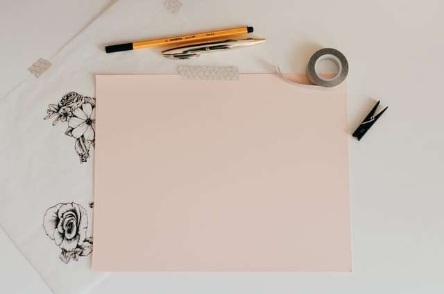
This blog is an outlet for me to write about my work and why I made certain decisions and maybe stir up some conversation about these matters as well as display some of my work and get feedback from others in the field (or random people surfing the net).
*All graphics shown on this site are not actual size nor proportion*
So, I wonder why I created the packaging that way. Dan and I discussed how to package the book. We had a lot of discussions about it – and then, we did it my way.
I think that is because I was afraid. I feared that if I showed you all my doubts, my questioning of myself, the process would be too difficult to follow. I didn’t want you to get lost, so I hid the corners of the maze.
I just realized I have been working on the same packaging for about five years. What is going on? I took a look at my old designs and started writing down what was the same and what changed.
I realized that I have been trying to work my way back to unity in art. The Packaging that way project was an attempt (as many of my projects are) to reduce the number of elements, to eliminate the unnecessary and make each element do more work. The last few years the packaging has become more complex, with more layers and a lot of different materials.
The main problem with this approach is that it is very hard to tell how well it works until you are finished. Sometimes you can feel it going off the rails but other times you can’t tell how successful you are until it is over.
I would like to go back to simplicity in my next project, but I think it will be a long journey.
The aim of my work is to design a packaging that will not just be noticed but also remembered. A packaging that will not just attract the consumer’s attention but also give a clue to its contents, and create an emotional response.
The first impression is vital: it has to have visual impact, as well as reflecting the essence of the product and its brand image. It has to tell consumers what they can expect from the product, in terms of quality, taste and usage. It has to offer clear guidelines as to where and how the product can be used, and help them decide whether it is worth paying a bit more for it.
The packaging has to encourage users to try new products, or buy them again when they are already familiar with the brand image. It has to protect the product from damage in transit and on sale; but at the same time it should not take up too much space or make products unnecessarily heavy. And then there are environmental considerations: the packaging must be recyclable or reusable if possible, and its production must have minimum impact on the environment. All this in one single design solution!
I am sure that you get what I mean! It’s not easy! But I believe that with passion, creativity, knowledge and experience I
I think the reason for this lack of unity in art is that we are unable to create a piece of art that is truly original. We are, at best, able to create a new variation on an old theme.
The reason I think we can’t create anything truly original is because I believe all art stems from one source; the artist’s mind. When an artist creates something, they are creating the work out of their imagination and using the tools available to them to bring it into physical reality.
As an example, let’s look at one of my favorite paintings, The Starry Night by van Gogh. It is obviously very different than say, Blue Sky by Childe Hassam. But if you look closer, they aren’t so different after all. Underneath all the color and texture and brush strokes, they are actually very similar in composition; a blue sky and swirling clouds that lead your eye into the distance. So even though they appear vastly different from each other, they are essentially the same thing. Now imagine that van Gogh created Blue Sky first and then painted The Starry Night as his own variation of it. I believe this is what happened.*
Unfortunately for us, when we look at art, there isn’t really any way to tell
I have always been fascinated with the concept of Unity in art. I am also always looking for examples that illustrate this concept.
Recently, I was looking at the first edition of The Elements of Style by William Strunk and E.B. White which is a very simple book (with only 90 pages) that gives advice on how to write well, and what should be included in your writing. This small guide has probably saved millions, if not billions of people from saying “I could care less” instead of “I couldn’t care less.”
For those who don’t know, there is a series of books called The Elements of Style that were written by a professor of English named William Strunk Jr. in 1918 (The Elements Of Style) and then revised by E.B. White in 1959 (The Elements Of Style) where it became a bestseller for over 50 years.
In these books, William and E.B. share their ideas about unity in art and how each piece of art must have unity to be successful:
“Unity in a composition may be sought either within or without the picture, or both within and without . . . If unity is sought within the picture, it may be found in one of three places: first, in the
ArtsPainter is a contributor at Arts Painter. We are committed to providing well-researched, accurate, and valuable content to our readers.
Table of Contents

