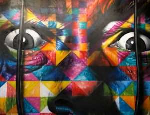
Color is a powerful and flexible element in artwork. It can enhance the mood, change the shape of an object or subtly alter the composition. The artist can use color to raise questions about form and meaning or simply to delight the viewer.
Color Theory and Color Devices will explore color theory and how to use colors in art with examples from my own work and from other artists. Learn how color works and how to use it to make your artwork more interesting and dynamic.
Warm colors advance, cool colors recede. (Or as I like to describe it: red is at you, blue is on you.) As with all color devices, this can be used for good or evil. It’s a fine line, but it can be used to make a picture feel more “alive” or more “stale”. A warm color that moves forward in space can be used to indicate something immediate and active, while a cool color that moves back can indicate something distant and uninvolved.
Quick tip: using only the warm/cool trick will likely lead to dull images, so learn the other color devices too!
Color theory is the study of the effects of color on viewers. It’s a relatively new branch of art history, with scientific methods being applied to the understanding and use of color in art.
Color Theory is concerned with color harmony, complementary colors, split complements, triadic colors, compound colors and much more. Color theory uses scientific methods to understand how we perceive color, and how we can use those perceptions in our own artwork.
We hope you enjoy Color Theory Blog.
The color wheel and colour schemes have been used for hundreds of years by artists, designers and architects to help create harmonious colour combinations. Although colour theory is sometimes seen as being very technical, it is also an art in its own right.
Learn about the different colour theories and colour devices that are used in art and design. Color theory can be used to create great visual effects when applied correctly and color devices are useful tools for creating harmony within a piece of art or design. By identifying and understanding the main principles of colour, you will be able to make informed decisions when choosing colours for your work.
The three color devices, harmony, contrast and emphasis can be used to create visual interest.
Harmony: This is a pleasing combination of colors that are related by one or more of the color relationships. All colors are related to each other in some way. Those colors that are opposite each other on the color wheel or that share a common color group such as complementary colors are called harmonious colors. For example, red and green or blue and orange. Also see split complementary colors.
Color Contrast: This is a deliberate combination of contrasting colors to achieve a certain effect. Contrast is used to direct the viewer’s attention to an area of interest, generally by means of a large amount of one color against a large amount of another color.
Color Emphasis: This is where one color dominates the image. The most common use for this type of emphasis is to make text stand out from its background.
The main thing to keep in mind when using any of these techniques is keeping them from becoming too much or they become gaudy and distracting.”
Rene Magritte’s “The Treachery of Images” shows his famous pipe and proclaims, “ceci n’est pas une pipe.” It is a picture of a pipe. I have drawn circles around the letters in the last sentence: This is not a sentence.
Taken at face value, Magritte’s work is nonsense. The painting is using one set of representational conventions – depicting a pipe – to deny the validity of another set of representational conventions – depicting words. The artist’s intent was to highlight how we often mistake pictures for reality and misread pictures as representations of things, when in fact they are representations of other things.
Taken at face value, my sentence is equally nonsensical. It uses representational devices – spoken language – to deny the validity of another set of representational conventions – written language. And yet it isn’t nonsense. This is not a sentence means something; it means what it says. I am just using writing to say something that can’t be said well in writing; that is, writing to say something about writing!
We resort to figurative language like this when we are trying to express something contingent or complex that resists direct expression. We don’t have words (or pictures) for some
ArtsPainter is a contributor at Arts Painter. We are committed to providing well-researched, accurate, and valuable content to our readers.
Table of Contents


